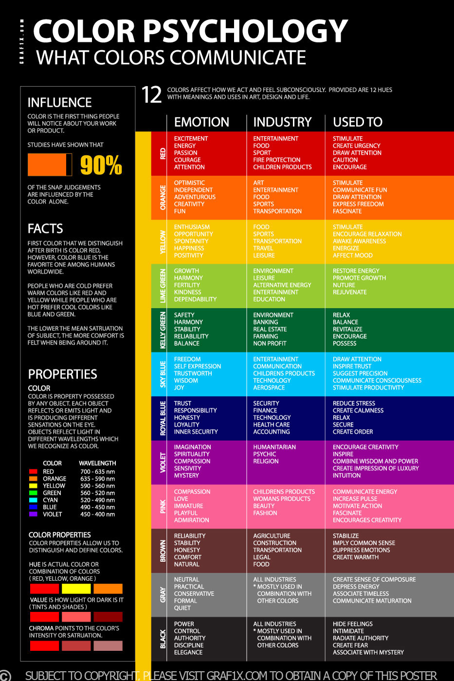
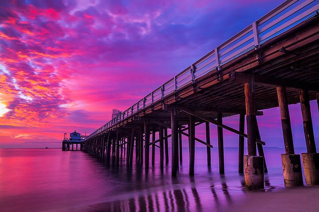
Tuesday, September 25, 2018

TEXTURE & PATTERN


Texture and Pattern 

Definitions -  

Texture - the feel, appearance, or consistency of a surface or a substance. Where a surface is a rough or raised 


Pattern- decorative design, as for e.g. wallpaper, china, or textile fabrics,     etc decoration or ornament having such a design.


Artist Research- 

Edward Henry Weston was a 20th-century American photographer. He has been called "one of the most innovative and influential American photographers… and "one of the masters of 20th century photography."[2] Over the course of his 40-year career Weston photographed an increasingly expansive set of subjects, including landscapes, still lives, nudes, portraits, genre scenes and even whimsical parodies. Weston was born in Chicago and moved to California when he was 21. He knew he wanted to be a photographer from an early age, and initially his work was typical of the soft focus pictorialism that was popular at the time. Within a few years, however, he abandoned that style and went on to be one of the foremost champions of highly detailed photographic images.


Image bank - 


Contact Sheets- 


My Best Images -  


Images that require improvement - 


Editing with photoshop - 


AO3: Record ideas, observations and insights relevant to intentions, reflecting critically on work and progress.

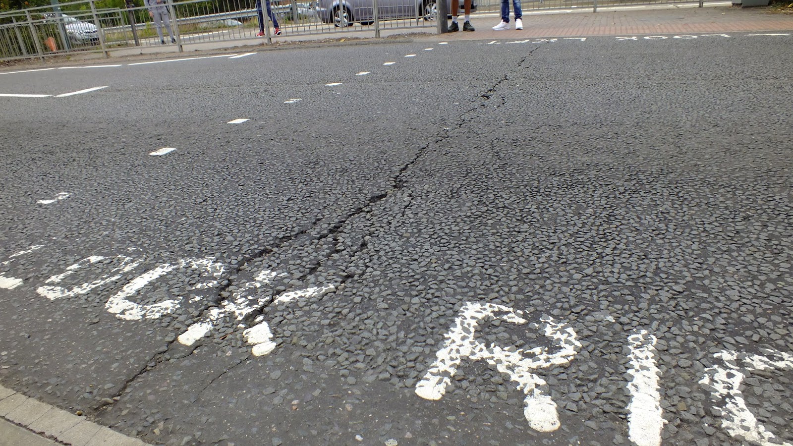
My idea for recording Texture and Pattern was to capture the various raised edges of an object or substance within Harlow. I managed to get a variety of different pictures varying from synthetic hair to the trees outside. My favourite image would be the one of the road saying 'look left' as I feel this is a really good picture to describe texture. The reason for this is because due to the ground eroding and wearing away it has created this nice uneven line down the middle which could even close up look like a tear in the earth. the use of stones and cement has also created a nice patterned surface. 

AO2Explore and select appropriate resources, media, materials, techniques and processes, reviewing and refining ideas as work develops.

I used a Fuji finepix HS25 EXR for the shots taken. I adjusted the aperture differently for each photo as some looked better from a wide shot and others a close up. I tried to look for objects that looked like that had some form of definition that could be captured. Once taking my pictures I then decided that I preferred the black and white image as it made the texture bolder and I could adjust my curves to make certain areas of the shot darker. In the majority of the pictures I used, curves, contrast and vibrance, however in one I used colour balance to adjust the tones. 


AO1: Develop ideas through sustained and focused investigations informed by contextual and other sources, demonstrating analytical and critical understanding.

The artist research was helpful as I realised that I was able to explore the variety of different textures through landscapes and objects. By looking at how he had photographed images and then edited them into black and white, I tried to create the same idea as I felt like the the negative space really added impact into each picture I was able to shoot. 

AO4: Present a personal and meaningful response that realises intentions and, where appropriate, makes connections between visual and other elements.  

Overall I feel I have really been able to capture texture and pattern by the artist research of Edward Henry Weston and exploring the idea of texture in more context. By focusing on various designs and elevated edges I have then captured what I believe to be examples of this. 


Friday, September 14, 2018

COLOUR

Colour 

Definition- 

Colour is one, or any mixture, of the constituents into which light can be separated in a spectrum or rainbow, sometimes including (loosely) black and white. However it can also be seen as the property possessed by an object of producing different sensations on the eye as a result of the way it reflects or emits light. 


In these 2 music videos both produced with Beyoncé we can see how they have used different tones and colour to represent the mood of the music throughout both videos. We can see how in the first video 'Hold up' there is a lot of bright colours and including a saturated yellow dress to contrast with the fruit behind. However, in the second video we see how by the colder tones of blues and the saturation being much lower it creates this sense of power and the two characters have a more serious look.


Colour chart -

Image result for colour mood chart warm colours


Muted colours are soft and gentle where as a saturated colours is the intensity of a hue from grey tone to pure vivid tone. 


Analogous are colours that are adjacent to each other on the colour wheel, e.g. yellow and green. They are colours next to each other on the colour wheel "get along" and are referred to as being harmonious. Analogous colours are often used in visual design and have a soothing affect.


Complementary colours are opposite to each other on the colour wheel, e.g. Blue-violet and yellow, represent colours positioned across from each other on the colour wheel. These colours exhibit more contrast when positioned adjacent to each other -for example yellow appears more intense when positioned on or beside blue or violet.


Primary colours are basic colours that can be mixed together to produce other colours. They are usually considered to be red, yellow, blue, and sometimes green.


Secondary colours are colours formed by mixing two primary colours.


Image result for secondary colors photography


Artist research William Eggleston -

William Eggleston (born July 27, 1939) is an American Photographer. He is widely credited with increasing recognition for colour photography as a legitimate artistic medium to display in art galleries. As a boy, Eggleston was introverted; he enjoyed playing the piano, drawing, and working with electronics. From an early age, he was also drawn to visual media, and reportedly enjoyed buying postcards and cutting out pictures from magazines.


 Image bank -


Contact Sheet- 


Best images - 


Images that need improvement- 


I feel as if these 3 images all require improvement. The main reason for this is that I feel the positioning of the camera was wrong. In the first picture I feel that In the last picture the lens hood was obscuring the periphery. 


Editing my photos on Photoshop- 


In these 3 photos you can see how I have used photoshop to edit the picture. I started off by adjusting the hue and saturation and making the tones have a more cooler complexion. Therefore the second image having tones that are more blue. I then continued by adjusting the vibrance to having more positive red tones creating the final outlook. 


AO3: Record ideas, observations and insights relevant to intentions, reflecting critically on work and progress.

My idea for recording colour was to capture the landscape and explore colour within fashion by looking at the different tones, contrasts and saturations. After researching Analogous colours, I decided to look at the photographer William Eggleston and his work which inspired me to look more at colours within scenery e.g. sunsets. I selected my best images because I feel that they are the ones that show the most variety of colour and how I can explore this in more depth.  In the first image I captured the Neon sign from a wide shot and a cantered angle. I then adjusted the aperture to create a more detailed image. 

AO2Explore and select appropriate resources, media, materials, techniques and processes, reviewing and refining ideas as work develops.

I used a Fuji finepix HS25 EXR for the shots taken. The images I took I shot from a variety of different angles and different apertures. However the photo of the sea and the sunset I took on my iPhone 7 which has
a six-optic lens, OIS and a wider f/1.8 aperture. I then used tools such as vibrance, curves, saturation and levels to edit my photos and make the final images really pop. 
AO1
: 
Develop ideas through sustained and focused investigations informed by contextual and other sources, demonstrating analytical and critical understanding.

The artist research was helpful as I realised that the exploration of colour meant that I could tackle the subject from a range of perspectives.  My research of William Eggleston helped me to focus on the ombre colours in scenery e.g. sunsets and sea. This was helpful to me as I was able to capture signs, clothes and nature all through colour.  The research on colour and geometric shapes was not particularly helpful to this study, however some of the shots would be easy to edit to try and emphasise the saturation and vibrance and this aspect could create a better quality picture. 

AO4: Present a personal and meaningful response that realises intentions and, where appropriate, makes connections between visual and other elements.  

 Overall I feel I have really been able to capture colour within my photos and by the artist research I was able to to experiment more with scenery and colours, although my first intention was not to photoshop the images, b doing so the effect I have created has been a more surreal one.  

PHOTOSHOP EDITS - 


FINAL EVALUATION

Here you will need to summarise how your work has developed as a result of the shoots and research that you have undertaken. ·         ...